Checkout experience for Indonesia
Company: Arrow (YC21)
Sector: e-Commerce, Fintech
Role: Product Design
Impact: 20.8% uplift in conversion rate

BACKGROUND

Arrow offers a checkout service for D2C brands in Southeast Asia. It integrates with different payment methods in the region and allows users to checkout anywhere be it in chats or social spaces; aka Headless Checkout.

It also syncs orders with its online store so merchants don’t have to worry about overselling inventory, creating orders, and reconciling payments in the backend. Additionally, Arrow allows:
  1. Returning shoppers to complete their purchases without the need to create an account directly on the online store in the first place.
  2. Users to enjoy express checkout experience on other brands that uses Arrow checkout
  3. Shoppers to pay with various payment methods that are market relevant such as Bank Transfers, Cash-on-Delivery, eWallet and BNPL. This approach makes payment accessible.
  4. Merchants to save 1-3% on transaction fee imposed by Shopify. Arrow charges merchants a flat-fee each month regardless of sales volume.

DESIGN & UX

The current design of the checkout uses a single-page checkout design that is familiar to the markets.

It is the same concept adopted from marketplaces' apps such as Tokopedia, Lazada and Shopee in their earlier years.

USER FLOW

PROBLEM: CHECKOUT RATE

Our checkout completion rate was far from global average.

46.1%

* Global average
26.4%
Our average
* Global Average is based on Littledata.io (an e-commerce data and analytics tool)

CHALLENGES

01

Lack of time and resources
We were at seed stage and there were only 2 engineers and I supporting all of the business verticals such as merchant onboarding, checkout and merchant portal

02

Low UX maturity & misalignments
Stakeholders were not fully aware of the adverse effects of poor designs on users, as their attention were directed towards acquiring merchants for growth.

03

Current build is hard to change
The product was built in a way that made it challenging to implement changes. The UI layer integrates to business logic, so modifying it requires a lot of engineering effort.

DESIGN OBJECTIVES

01

Improve the conversion rate and usability of the checkout experience
Success is also measured by its effectiveness, efficiency and satisfaction

02

Define the UI and Interaction library
Have a scalable UI and Front-end library that works for design, engineering and product.

In-depth analysis

A comprehensive analysis of the current checkout process was conducted to enhance the online checkout experience. This analysis employed three key approaches:
  • Data Evaluation
  • Heuristic Evaluation
  • User Research & Moderated Usability Testing

DATA EVALUATION

About 30% of users drop-off right when they start the checkout process—before the checkout screen fully loads. Initially, we attributed this issue to the checkout's load time. It was impossible to reach out to these users as we have yet to capture their phones and email addresses at this juncture of the checkout process.

Approximately 37% did not input their personal details and address. Of those who did input their personal details only, we contacted 8 of them. And the feedback given by ALL of them was failure to locate address using Google Map.

HEURISTIC EVALUATION

The heuristic evaluation identified potential usability issues in accordance to the 10 general principles for interaction design

View Report

USER RESEARCH & MODERATED USER TESTING

We sought help in the user research by recruiting a local researcher in Jakarta as we wanted eliminate language barrier for the test. We recruited 10 participants with the following requirements:
The participants will then perform the following tasks:
TESTING RESULTS
60%
Completion Rate
158s
Average Time Taken
40%
Error Rate on Address
Problem areas we discovered:

01

Delivery Address
Unable to locate delivery address were the sole reason for failure to complete the checkout process. Jakarta is a Tier 1 city, hence it is safe to conclude that users from different tiered city will likely face a higher rate of failure.

02

Returning User Experience
Participants felt that the OTP screen as a returning user appeared to suddenly after entering their mobile number making them feel that a payment is about to go through.

03

Lack of Summary
We noticed participants spent considerable amount of time scrolling through the form to check their entries before proceeding with payment.

The redesign

The redesign of the checkout comes in 4 parts:
  • UI and Code Library
  • New delivery address API
  • Progressive Disclosure Design
  • Usability Testing

UI AND FRONT-END LIBRARY

To get approval for a redesign, we needed to make the redesign faster and scalable for the future. The engineering team and I created a list of requirements for an existing library, so we didn't have to build one from scratch due to time and resource constraints. The requirements were:
  1. Runs on Vue3.js
  2. Has a strong user base and a community behind it to prove its credibility and have support when needed
  3. Can be themed to reflect our branding
  4. Based on good design principles
After going through many libraries, we adopted Vuetify as it checks all the boxes.

ADDRESS API

It was clear that using Google Map was not ideal for delivery addresses in Indonesia. We learned that for the shipping rates to be successfully fetched, Province, City, District and Postal Code parameters needed to correspond to each other.

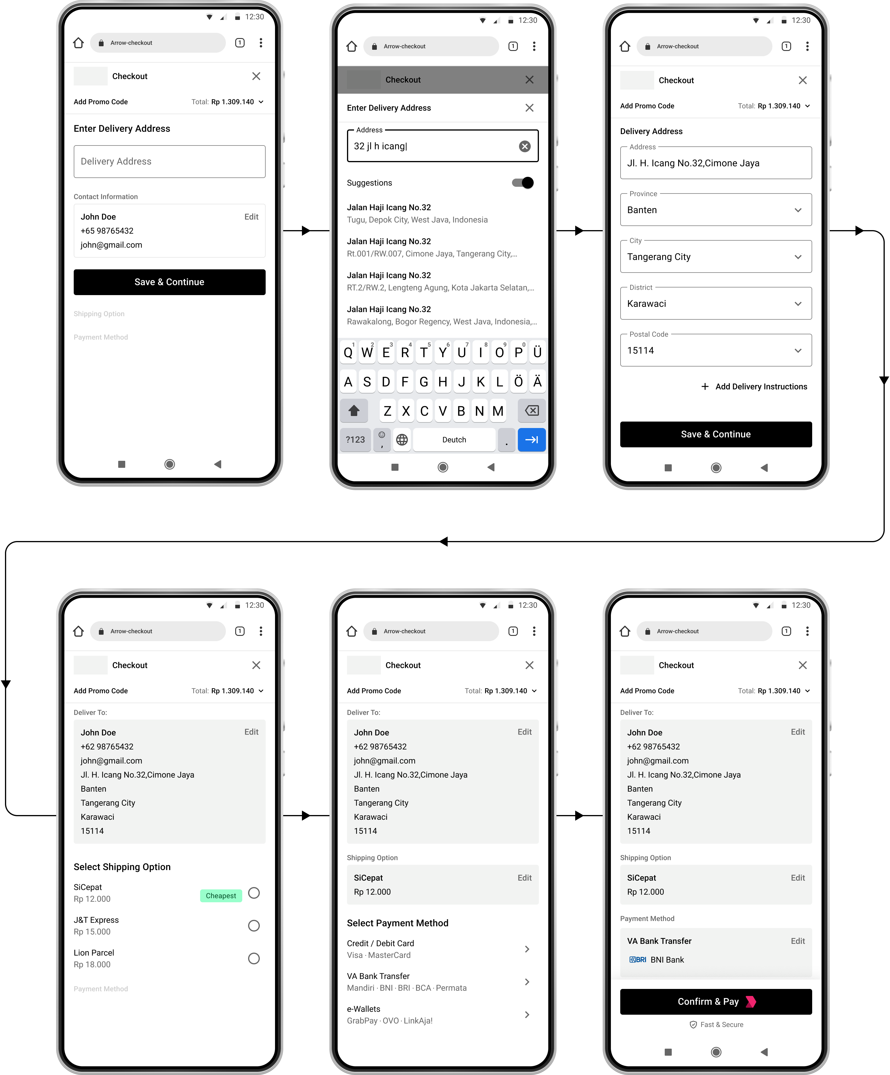
By leveraging on Biteship, users have multiple ways of entering delivery address.
DELIVERY ADDRESS INPUT
Option1: Auto-fill
With better accuracy mapping, users can have their addresses auto-filled and have the chances of committing an error significantly reduced.
Option 2: Manual Entry with Guidance
User can input delivery address by using appropriate options that correspond with one another. This purposeful restrictions is a form of error prevention.

PROGRESSIVE DISCLOSURE

During the redesign, we quickly ran into a problem, by incorporating the best practises (such as having the form label displayed at all times and having margins in between the fields for error/helper text) , the checkout page started to look like a long process potentially causing more drop offs. Previously, the design utilised compression of the form fields to make the checkout process seems short at the expense of usability.
Design Exploration
Current Design
How might we optimize the checkout process to create a visually efficient and frictionless experience, ensuring users perceive it as fast and seamless, leading to increased satisfaction and completion rates?
Progressive Disclosure is about presenting only the action required to move forward, thereby making it easy for new users to complete tasks. It makes complex flow appear simple because you are managing the users cognitive load.
LOGIN / SIGN UP FLOW
DISPLAYING ONLY WHAT IS REQUIRED TO REDUCE COGNITIVE LOAD
SUMMARISING THE INFORMATION

USER TESTING

We used the same parameters, requirements and tasks as before and the test result showed huge improvements on usability
100%
Completion Rate
96s
Average Time Taken
0
Error Rate on Address

IMPACT

We implemented the new design on one of our merchants and saw a huge improvements in the conversion rate

26.4%

Previous average
47.2%
New average