
As teams grow, it’s common for designers and engineers to concentrate on discrete areas of an app. Such as search and discovery, account management, and more. This leads to a fragmented visual and code language.Tangram Design System is a series of styles and components. It is built systematically, and follows the same universal principles.

The value of a design system can only be appreciated when it is adopted. Hence, it is imperative to have an alignment within the design, development and business teams on what we want to accomplish.
Tangram components need to come in many variants that cover different use cases. They are to be created by reusing components and code.
With only one single source of truth, we want Tangram to be easily maintainable. No more asking who has the latest design.
Look and feel change over time. Tangram needs to keep up with the latest design trends.
With Tangram Design System, we aim to save production hours and help speed up the UI design and development process for every project.
We want Tangram to take care of the UI patterns. This allows the team to shine by enabling them to focus on the users, not pixels.
Tangram needs to support all the three different platforms (Web, iOS and Android). It must be based on the best practices with clear set of standards.
By using Atomic Design methodology (by Brad Frost) and the concept of Design Tokens, the design system will not only achieve consistency, but also the ability to adapt to future design trends as the 'styling' elements of the components are separated from the component itself.

We start by creating the smallest items, atoms. When all of the atoms are built, we turn our attention to the slightly bigger items until we have a molecule. Once you’ve combined several molecules, you’ll be able to create a more complex structure, an organism. By doing this, the designs are consistent at it is made up from the same atoms.

Design trend changes over time and design tokens help us to update the look and feel of the components easily. Instead of updating the styling of each and every component, now we can update it at the token level and all of the components that use the same token will be updated to the latest design.
National Trades Union Congress (NTUC) has many different brands such as FairPrice, Health, Income etc and each brand has its own colours. We needed a systematic way of how the colours are generated so Tangram can support all the different businesses.
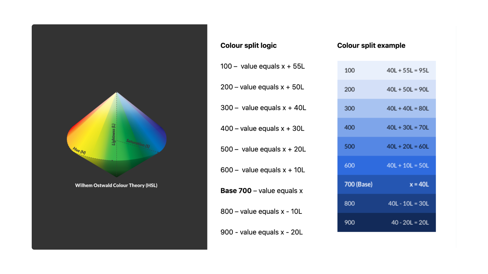
Adopted from Ostwald's colour theory, HSL is an alternative representation of the RGB colour model that designed in the 1970s by computer graphics researchers to more closely align with the way human vision perceives colour-making attributes. In this model, colours of each hue are arranged in a radial slice, around a central axis of neutral colours which ranges from black at the bottom to white at the top.
Adopted from Ostwald's colour theory, HSL is an alternative representation of the RGB colour model that designed in the 1970s by computer graphics researchers to more closely align with the way human vision perceives colour-making attributes. In this model, colours of each hue are arranged in a radial slice, around a central axis of neutral colours which ranges from black at the bottom to white at the top.
We consider accessibility from the start because:
Affects physical capacity, stamina, or dexterity.
A disability of the senses such as sight, hearing, smell, touch or taste.
Difficulty with mental tasks than the average person.
Temporary disability or limitation. Like language when in a foreign country.

An example of this is UX writing. Automated test cannot pick up if the content is written in a way that people with cognitive impairments can easily understand it.

This design works well for most users with no visual impairments. But people with achromatopsia or monochromacy, (As shown in B) cannot perceive colours. This affects the usability of the design as the active and inactive states look rather similar.

iOS solves this by adding | and O labels in the component to differentiate between active and inactive state. The labels however, are uncommon in Singapore. This may lead to unfamiliarity.

In Tangram, we use a more universal labels to differentiate between active and inactive state by using tick and cross for easy recognition.
To get a buy in from both management and product teams, they need to see the value of the design system quickly. We want the design system be:
The demo video showcased the design system in Sketch with Animaa plugin to support the dynamic sizing. Then, Figma did not support auto layout. We eventually migrated the design system to Figma when auto-layout was released in 2019.
WIP of Figma can be viewed here.
To ensure Tangram can support business needs and different uses cases, it needs to be comprehensive.
We do this by creating variants of the same component with distinguishable use cases.We believe every design should be intentional. This will further create consistency in the product experience.

